Usability study focused on 6 data-driven
solutions for client webstore drop-off rates
and discoverability.
Role
Research
This was a sponsored project where I conducted usability studies for Nordstrom as a client, working directly with members of Nordstrom's UX Research team.
In this project I conducted a mix of remote and in person usability testing sessions focused on Nordstrom’s appointment booking portion of their website. Additionally, I conduced a data synthesis and provided recommendations to the client based on the testing data. Zoom and Google Docs were used for the usability testing and Figma for group data synthesis.
This project provided me with hands-on experience of what working in the user research and usability testing field is like, as well as the experience of working with clients.
Course
HCDE 517: Usability Studies | Winter 2024
University of Washington
M.S. Human Centered Design & Engineering
10 Week Timeline
Methods & Tools
Usability Testing
Data Analysis
Zoom
Figma
Google Docs
Team
Alisha Mudbhary
Jinzhao Chen
Purva Tekker
Seamus McPeake
At a glance
The Problem
Nordstrom's desktop personal stylist appointment booking flow was experiencing a high drop-off rate.
The Findings
1) Discoverability for appointment booking is a major challenge.
2) Filling out the "Additional Information" page was challenging for users.
3) Moving backwards in the appointment booking flow created issues for users.
The Impact
Some feedback from the Nordstrom UX Team:
"So glad to have these teams validate what we've been wanting for months!"
- Nordstrom UX Research Staff Member
"Your research is incredibly helpful and will be referenced again and again!"
- Nordstrom UX Research Staff Member
The Context
Leading fashion retailer that does more than
sell clothes.
Helping customers express their style - not just buy fashion.

Taking focus
I was very familiar with the Nordstrom brand and became excited to work with them once I saw they were a sponsor for my course.
Once I was onboarded with my group-mates we were put in contact with 2 UX researchers from Nordstrom to fill us in on they were working on.
Nordstrom is a popular fashion retailer offering a wide selection of clothing, shoes, beauty products, and services for men, women, and children.
Nordstrom has over 362 flagship stores across the United States, with a strong online presence and shipping services available to over 30 countries worldwide.


The Problem
Reports of high drop-off rates for personal styling
appointments.
Nordstrom's website allows users to book appointments for personal styling in store, and had a high drop-off rate.
The sponsors couldn't share the numerical data with us, but this information was enough to work with to create a study.
In addition to drop-off rates, I let our sponsors know we were interested in researching discovery of the appointment booking portion of the website.
The Goals
Research Goal #1
"Is the existence of appointment booking intuitive and apparent?"
Research Goal #2
What factors contribute to the high drop-off rate during the stylist appointment booking process on Nordstrom's website?"
Research Goal #3
"What, if any, parts of the appointment booking process are frustrating users?"
The Research
Let's get feedback straight from the source.
With the approval of the project sponsors I was able to focus on a simple set of users: individuals interested in personal styling.
With assistance from my group I was able to craft a survey to gather participants.
As long as they were over 18 years of age, had experience with shopping at a similar store, and had an interest in personal styling, they were on board.
For the interview stage, participants engaged in a mix of virtual and in-person think-aloud usability sessions.
I always kept somebody by my side to take notes during interviews and recorded with zoom so nothing would be missed.

Participants were eager to help out!
Insight #1
From the navigation bar and clothing categories to the search bar; users can't find the appointment booking page.

"Am I on the right page?" - Participant
Discoverability is a major issue.
Insight #2
The "Additional Information" page was difficult for users.
After filling out information about themselves, users are presented with a full page of information about themselves to fill out.
Questions like "How would you describe your style" were confusing for participants looking for styling help, especially without options to choose from.
""If there was a way to put photos of clothes I would wear instead that would be great because I don't know what the nomenclature is" - Participant

Low assistance for participants who may not have a personal style developed.
Limited sizing information and assistance.
Participants noted the lowest amount they typically spend is lower than the lowest option listed.
Insight #3
Moving backwards in the flow causes issues.
An issue arose after participants had selected a personal stylist, proceeded to choose a date and time, only to find their availability did not align with what the stylist has available.
When participants moved back in the flow to change stylists, they were directed to the page that allows users to select their service type.
Check out a video of a participant running into this issue on the right!
Insight #4
Confusing confirmation page.
After picking the location and service for a personal styling appointment, users are presented with a page asking them to confirm their selection.
This caused confusion for users, having them wonder if this was the final step in their appointment booking process without picking factors like a date or time.
Check out a video of a participant running into this issue on the right!
The Solutions
Problem Statement #1
"How might we increase the discoverability of the styling services section on the Nordstrom website?"
Recommendation #1
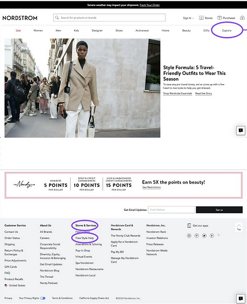
Move it where users are looking.
The main navigation bar was the initial point of reference for half of the participants. Participants tended to first explore links categorized under "Men", "Women", and "Designers" before navigating to the "Explore" section where the styling service page is located.
Recommendation:
Include a styling services link under these prominent category links in addition to the current placement under "Explore".

To illustrate this, I created a low fidelity mockup showing a new location for the styling services hyperlinks. Check it out on the right!

Styling & Services can now be found under the "Men" category in the main navigation bar.

The Styling & Services options are the same as under Explore.
Problem Statement #2
"How might we help users confidently share their personal style, sizing, and spending preferences by making the additional information page more clear, relatable, and flexible?"
Recommendation #2.1
Help users express their style.
Users struggled to find ways to type their style using words. The current system in place puts a lot of cognitive load and expectation of work on users to articulate a complex concept.
Recommendation:
Give users visual queues to assist them articulate their style.
To illustrate this, I created a low fidelity mockup showing visuals users may find relatable to their personal style. Check it out on the right and below!
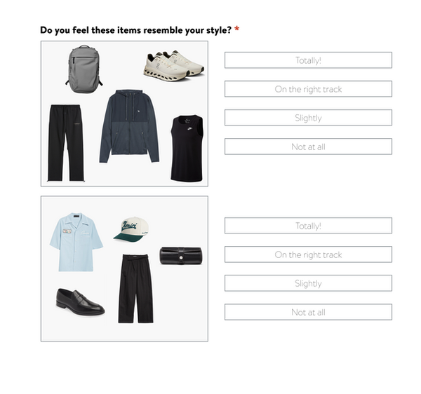
Visual queues allow users to understand styles that could be similar to what they're looking to try or currently wear.

Integration of the previous image into the Nordstrom "Additional Information" page in the styling appointment booking flow.
Recommendation #2.2
Allow users to give more details about their sizing.
Users selecting their size got confused by symbols like S, M, and L. Users were looking for more specific information about the sizing for specific brands or products.
Recommendation:
Giving users the option to enter their own sizing or giving users sizing information would help them understand what sizing to enter.
To illustrate this, I created a low fidelity mockup showing a section on the sizing information where users can enter their own sizing. Check it out on the right!
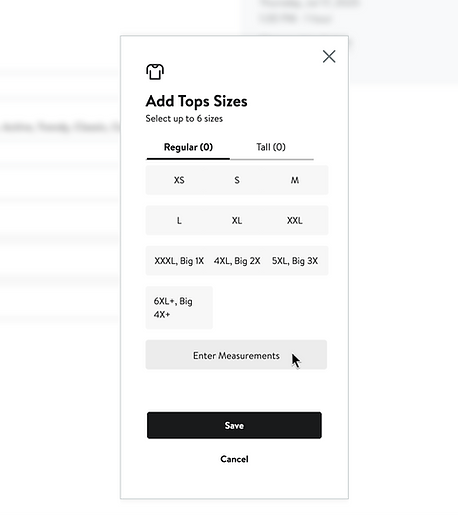
Button for users to enter their own measurements

Specific sizing options for users to choose from.
Recommendation #2.3
Give users budget flexability.
When adding the budget for each clothing category, users did not feel comfortable picking any of the options presented for budget.
3 participants felt that the options were too restrictive, and mentioned they would have preferred to enter their own budget.
Recommendation:
Give users the option to enter their own budget, or give them a wider variety of budgeting options to choose from.
To illustrate this, I created a low fidelity mockup showing a larger variety of budget options. Check it out on the right!

A drop down option for users to choose their budget for each clothing category.
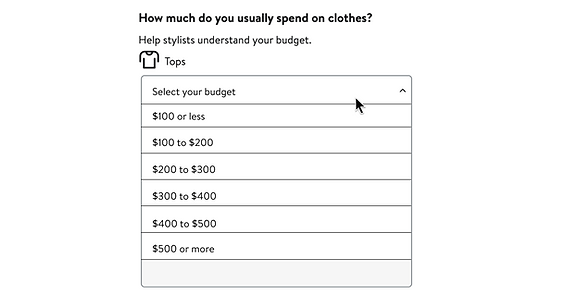
A larger variety of budgeting options than the original.
Problem Statement #3
"How may we fix the fluidity in the appointment booking flow to help users feel in control and prevent frustration?"
Recommendation #3
Moving backwards in the flow causes issues.
An issue arose after participants had selected a personal stylist, proceeded to choose a date and time, only to find their availability did not align with what the stylist has available.
Because there are multiple facets to this issue, there are multiple solutions.
Recommendation:
1. When users press the back button on the availability page, bring them back directly to the staff page in the appointment booking flow (code issue)
2. Integrate the stylist selection section into the date and time page, allowing users to select different stylists, and appointment dates on the same page.
To illustrate this, I created a low fidelity mockup showing an integration of the stylist selection section on the date and time selection page. Check it out below!

Recommendation #4
Remove what is confusing users.
The confirmation page in the appointment booking flow is confusing users due to its placement in the process.
Users are confused why they are seeing confirmation without giving all of the information they need to book the appointment.
Recommendation:
Remove the confirmation page from the appointment booking flow.
The confirmation information can already be seen at the end of the appointment booking flow.
To illustrate this, I created a low fidelity mockup showing a larger variety of budget options. Check it out on the right!
The Impact
Long lasting insight and validation
Because this was a sponsored project, I didn't get to see how the impact from these findings played out in long-term.
Nordstrom's UXR team was kind enough to provide short term feedback, in that they found the findings to serve as validation for what they had been looking for.
“So glad to have these teams validate what we’ve been wanting for months!”
- Nordstrom UX Stakeholder
“Your research is incredibly helpful and will be referenced again and again!”
- Nordstrom UX Stakeholder
Implementation
The Nordstrom styling service flow has been updated to remove the "confirmation" page. After selecting a service, users are presented with a stylist, and then a date and time page.
No direct data
Because I am no longer in contact with the Nordstrom team, I cannot confirm or deny whether these changes come directly as an impact of the work I've done, or any numerical data related to drop-off rates or discoverability.
Ideally I would like to see the direct impact of the research I did, but that is part of the limitations of doing sponsored academic projects rather than real-world projects.
Reflection
Client Work
This was my first time working with a real world client on a project, and I couldn't have been happier to work with a company like Nordstrom. The project sponsors I had were great in guiding and validating my research choices.
Self Initiated Designs
The design mockups were made on my own and not a necessity for the project.
The designs were made with the intention of being a high level reflection of the research data and are not a true reflection of what the real world designs would be.
Research Variety
Although this was primarily a usability study, I was able to practice utilizing both qualitative and quantitative data in this study. Sorting through both data sets and linking them to a final conclusion wasn't something I had experienced as a researcher.