Usability study focused on 6 data-driven solutions for client webstore drop-off rates and discoverability.
Role: Research
Impact:
This was a sponsored project where I conducted usability studies for Nordstrom as a client, working directly with members of Nordstrom's UX Research team.
In this project I conducted a mix of remote and in person usability testing sessions focused on Nordstrom’s appointment booking portion of their website. Additionally, I conduced a data synthesis and provided recommendations to the client based on the testing data. Zoom and Google Docs were used for the usability testing and Figma for group data synthesis.
This project provided me with hands-on experience of what working in the user research and usability testing field is like, as well as the experience of working with clients.
Course: HCDE 517: Usability Studies │ Winter 2024
Team: Seamus McPeake, Alisha Mudbhary, Purva Tekkar, Jinzhao Chen,
Timeline: 10 weeks
Methods: Usability Testing, Data Analysis
Tools: Zoom, Figma, Google Suite
The problem
Nordstrom's website allows users to book appointments for personal styling in store, and had a documented high drop-off rate.
The research
The insights
The design recommendations
The impact
Let's get feedback straight from the source.
Discoverability is a major issue
With the approval of the project sponsors I was able to focus on a simple set of users: individuals interested in personal styling.
With assistance from my group I was able to craft a survey to gather participants.
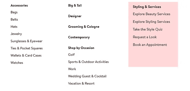
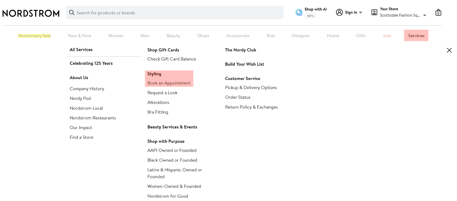
From the navigation bar and clothing categories to the search bar; users can't find the appointment booking page.
The only way to access styling services is under categories that aren't obvious and require users to access new pages.
"Am I on the right page?" - Participant
As long as they were over 18 years of age, had experience with shopping at a similar store, and had an interest in personal styling, they were on board.
For the interview stage, participants engaged in a mix of virtual and in-person think-aloud usability sessions.
INSIGHT 1
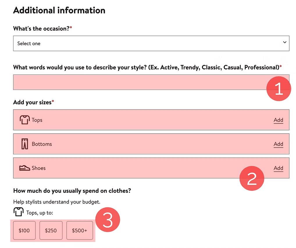
The "Additional Information" page was difficult for users.
After filling out information about themselves, users are presented with a full page of information about themselves to fill out.
Questions like "How would you describe your style" were confusing for participants looking for styling help, especially without options to choose from.
"If there was a way to put photos of clothes I would wear instead that would be great because I don't know what the nomenclature is" - Participant
"That page felt like it was final, so I expected to see the time I was going" - Participant
INSIGHT 2
Low assistance for participants who may not have a personal style developed.
Limited sizing information and assistance.
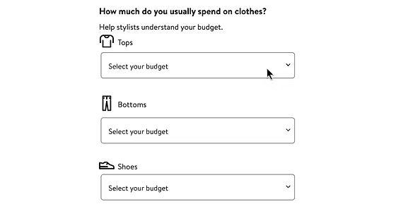
Participants noted the lowest amount they typically spend is lower than the lowest option listed.
The Explore tab at the top of the page will bring users to a new page.
The stores and services options at the bottom of the page were not obvious points for users to access personal styling appointments.
Image of the page where issues moving back would occur in the appointment booking flow.
Visualization of how the appointment booking error occurred and how the flow should work.
Screenshot from a usability testing session showing the premature confirmation page.
Navigation issues
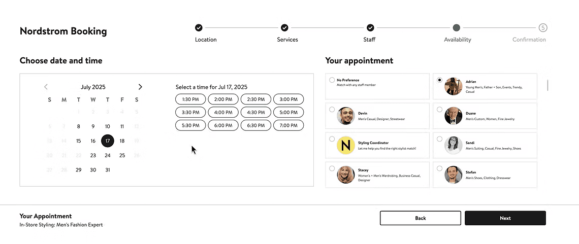
An issue arose after participants had selected a personal stylist, proceeded to choose a date and time, only to find their availability did not align with what the stylist has available.
When participants moved back in the flow to change stylists, they were directed to the page that allows users to select their service type.
This error only occured for users on the availability or confirmation page and would bring users back to the services selection page.
INSIGHT 3
Our research goals:
Understand why users are dropping off
Understand whether the styling feature is difficult to find
Understand what specific friction points exist in the flow
PARTICIPANT INFORMATION
Survey Participants: 31
Interview Participants: 8

Create discoverability where users are looking.
Creating a designated section within the navigation bars for personal styling will help users find and gain awareness of the services.
I recommended putting the services within the gender category tabs because most users searched for the services in those sections.
Creating its own section is another possibility, but since the research didn't back up anybody requesting it, I recommend it more lightly.
RECOMMENDATION 1
Revamp the "Additional Information" page.
The additional information page was where every user ended up having issues or complaints.
The additional information page asked users to textually communicate how they would describe their style. Many users struggled to do this, so I recommend giving users visual cues to give them options of what they feel may best represent how they want to look.
Users selecting their size got confused by symbols like S, M, and L. Users were looking for more specific information about the sizing for specific brands or products.
Giving users the option to enter their own sizing or giving users sizing information would help them understand what sizing to enter.
Because people looking for styling help often can feel aimless about their unique style, giving them options of how they would like to look gives the stylist and user an idea of what they might be picking up.
RECOMMENDATION 2
Communicating style
Communicating sizing
When adding the budget for each clothing category, users did not feel comfortable picking any of the options presented for budget.
3 participants felt that the options were too restrictive, and mentioned they would have preferred to enter their own budget.
I recommend giving users the option to enter their own budget, or give them a wider variety of budgeting options to choose from.
Communicating budget
Preserve user progress during back navigation.
Preserving navigation state when users press the browser's back button will return them to the step they just came from, rather than skipping past it.
I recommended storing each step in the flow's history so that back button presses map directly to the previous step, since users expect standard browser navigation to move one step at a time.
This is a comparatively small technical fix, but it addresses a bug that could easily cause users to lose their selections and abandon the flow altogether.
RECOMMENDATION 3
IMPLEMENTATION

Implemented navigation flow.
Visualization of the flow of the appointment booking session and how going backwards in the flow should work.
Visualization of the flow, removing the confirmation page. This confirmation screen wasn't part of the flow's labeled steps, but it appeared here between services and staff selection so that's where it's shown in the diagram.
Page that shows instead of where confirmation page would be in old flow.
Moving back in the flow
After picking the location and service for a personal styling appointment, users are presented with a page asking them to confirm their selection.
This caused confusion for users, having them wonder if this was the final step in their appointment booking process without picking factors like a date or time.
Premature confirmation page
Remove the premature confirmation page.
Changes implemented or in production
Removing the confirmation screen that appears right after selecting a location and service will prevent users from mistakenly believing their booking is already complete.
These are changes that have been implemented into the Nordstrom personal styling appointment booking flow. Some are direct design changes, others took different directions.
I recommended cutting this step entirely, since a full confirmation summary already appears at the end of the flow — making the earlier screen redundant rather than informative.
This is a low-risk change: it doesn't require designing new content, only removing a step that duplicates information users receive later anyway.

Our research found that the confirmation screen appeared too early, causing users to believe their booking was already complete. Nordstrom has since replaced it with a running appointment summary that stays visible as users move through the flow the confirmation step we recommended removing no longer interrupts the process.
Premature confirmation page removed (direct implementation)
The browser back button previously skipped users past the step they'd just come from. This has since been fixed — pressing back now returns users to the correct previous step, matching the behavior we recommended.
Back navigation bug fixed
(direct implementation, behavior only)
The open ended style, sizing, and budget prompts we identified as a source of friction have been replaced by a single optional field, folded into the final step of the flow a different approach than we proposed, but one that resolves the same underlying problem.
Additional information page revamped (broader validation)
New page showing additional information option on confirmation.
Personal styling is now listed under a dedicated "Services" tab in the main navigation the alternative solution we proposed for improving discoverability, rather than our primary recommendation of placing it within gender category tabs.
New "services" navigation tab
(implemented alternative recommendation)
My reflection
WHAT I'D HAVE CHANGED
What I'd like to have happened differently
Making an impact
"So glad to have these teams validate what we've been wanting for months!"
- Nordstrom UX Stakeholder
PARTICIPANT INFORMATION
Survey Participants: 31
Interview Participants: 8
"Your research is incredibly helpful and will be referenced again and again!"
- Nordstrom UX Stakeholder
My team didn't have a lot of time for this project, so we ended up just presenting written recommendations to stakeholders. I created my own visualizations for how I imagine the design recommendations would look, but I'd like to have time to collaborate with my team.
More time for team to create design recommendation mockups
Recruiting participants for this was difficult given how niche the target group was for this project, existing or prospective personal styling customers. The timeline didn't leave much room for recruitment and I do wish we'd have had more time for a greater N set.
Recruitment constraints
Working with a real company on a live product was the most rewarding part of this project. Seeing our research translate into actual changes not, just a grade, made the constraints and long hours worth it. I'm grateful to Nordstrom's UX Research team for the opportunity, particularly Angela Sharer and Hannah Nursalim, and to my teammates, Alisha Mudbhary, Jinzhao Chen, and Purva Tekker, for the work we did together.